
With the recent global pandemic, I created a space for maintaining good mental health, for adults living/working remotely alone.
There has been increasing evidence that shows how a global pandemic is having a negative impact on peoples mental health.
Recent evidence:
UX Research
To get a better understanding of the potential users of the app. I undertook screener surveys using Google Forms. Interviews were documented using Miro. This enabled a better understanding of users needs, pain points and how they use their wellbeing apps to maintain their wellbeing.
Key findings were that users preferred tools that are quick and easy to use. Gamification is a great incentive for users.
Design: Concepts & Sketching
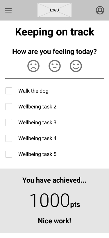
Ideating using the crazy 8’s technique, whilst building the affinity map, it was evident that a needed feature of the product is a task list-based design and gamification to encourage users to add and complete more tasks to better their mental wellbeing.
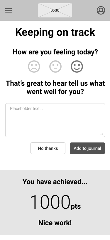
A key idea for the wording on the “How are you feeling” screen came about from one of the participant interviews. When the user selects the neutral face, the question “That’s ok, what would you do differently tomorrow?” appears above the comments field. The interviews helped shape the tone and language used for the app.
Lo-fi prototyping
By creating lo-fi sketches of the featured app, I could work out where best to place each element on the screen, without having to redraw complex graphics or layouts. It was this way of working that steered me in the direction of the current placement of the on-screen elements.

Validation. Usability. Feedback.
This was where the prototypes were really put to the test. With two rounds of usability testing, the first round with a mid-fidelity prototype helped me iron out any kinks in the early prototype.
With the changes made a second hi-fidelity prototype was tested and the insights gained from these sessions were a real eye-opener and helped move the app forward toward the current design iteration.
Design: Iteration
Understanding the user’s pain points from the usability testing led me to the current design iteration. These pain points were in the first steps of the usability testing, these changes were the redesigning of CTA’s, making the buttons clearer to improve the task success rate.
The feedback from an accessibility checker provided me with the correct colour contrasts for use in the final design iteration.